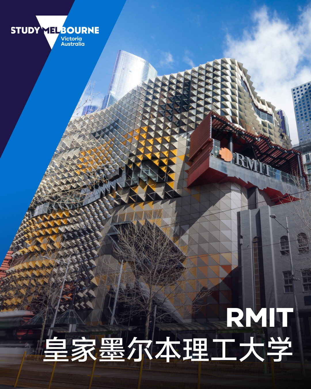
澳-皇家墨尔本理工大学-RMIT 2026年2月简讯:托福 iBT 英语语言能力要求更新 / 18岁以下国际学生校内照护模式
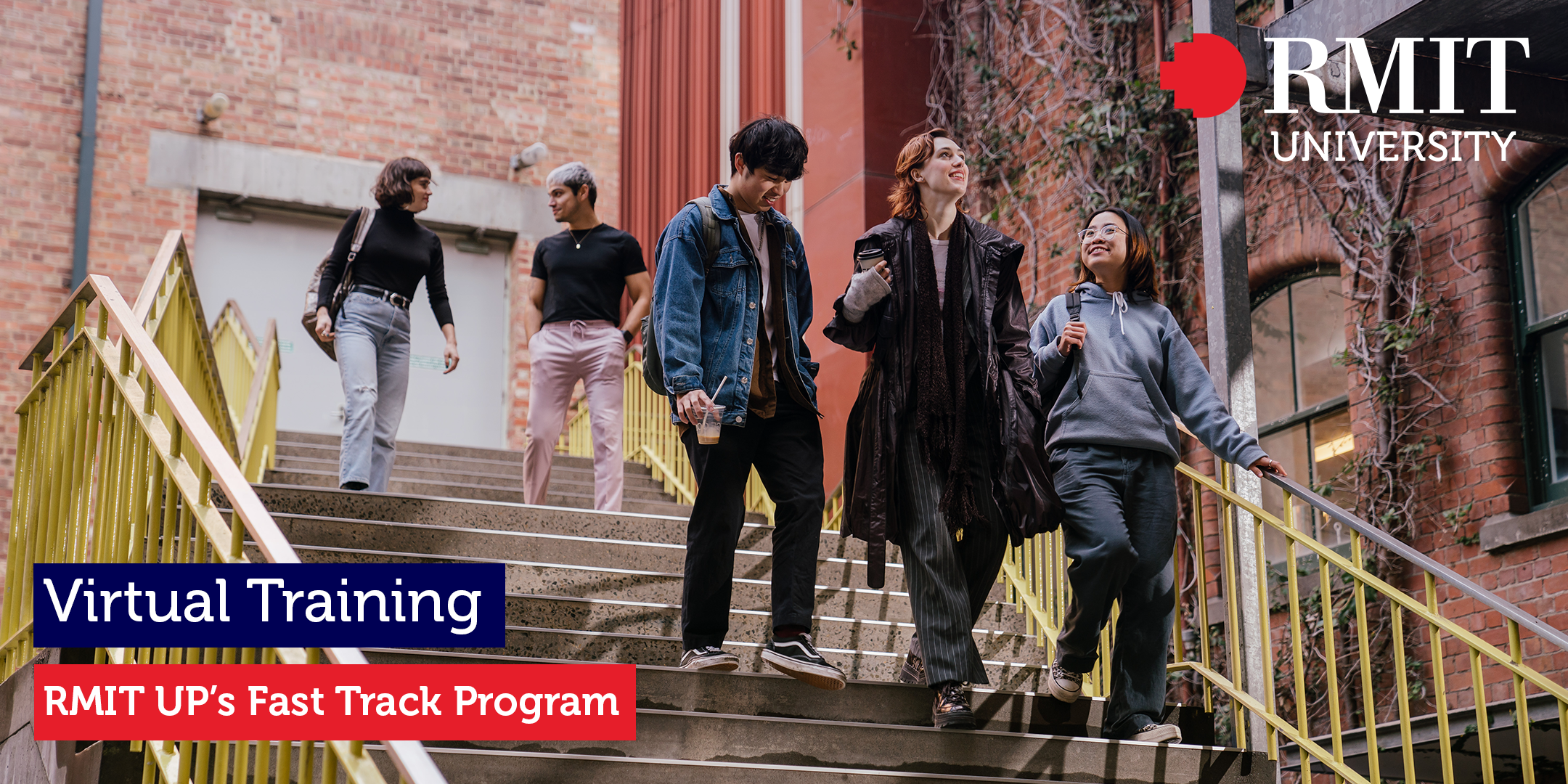
RMIT/* What it does: Tells the email client that only light styles are provided but the client can transform them to dark. A duplicate of meta color-scheme meta tag above. */ :root { color-scheme: light; supported-color-schemes: light; } /* What it does: Remove spaces around the email design added by some email clients. */ /* Beware: It can remove the padding / margin and add a background color to the compose a reply window. */ html, body { margin: 0 auto !important; padding: 0 !important; height: 100% !important; width: 100% !important; } p{ padding: 0 !important; margin: 0 !important; } /* What it does: Stops email clients resizing small text. */ * { -ms-text-size-adjust: 100%; -webkit-text-size-adjust: 100%; } /* What it does: Centers email on Android 4.4 */ div[style*="margin: 16px 0"] { margin: 0 !important; } /* What it does: forces Samsung Android mail clients to use the entire viewport */ #MessageViewBody, #MessageWebViewDiv { width: 100% !important; } /* What it does: Stops Outlook from adding extra spacing to tables. */ table, td { mso-table-lspace: 0pt !important; mso-table-rspace: 0pt !important; } /* What it does: Fixes webkit padding issue. */ table { border-spacing: 0 !important; border-collapse: collapse !important; table-layout: fixed !important; margin: 0 auto !important; } /* What it does: Uses a better rendering method when resizing images in IE. */ img { -ms-interpolation-mode: bicubic; } /* What it does: Prevents Windows 10 Mail from underlining links despite inline CSS. Styles for underlined links should be inline. */ a { text-decoration: underline !important; color: #000054; text-decoration-color: #000054 !important; } /* What it does: A work-around for email clients meddling in triggered links. */ a[x-apple-data-detectors], /* iOS */ .unstyle-auto-detected-links a, .aBn { border-bottom: 0 !important; cursor: default !important; color: inherit !important; text-decoration: none !important; font-size: inherit !important; font-family: inherit !important; font-weight: inherit !important; line-height: inherit !important; } /* What it does: Prevents Gmail from changing the text color in conversation threads. */ .im { color: inherit !important; } /* What it does: Prevents Gmail from displaying a download button on large, non-linked images. */ .a6S { display: none !important; opacity: 0.01 !important; } /* If the above doesn't work, add a .g-img class to any image in question. */ img.g-img+div { display: none !important; } /* What it does: Removes right gutter in Gmail iOS app: https://github.com/TedGoas/Cerberus/issues/89 */ /* Create one of these media queries for each additional viewport size you'd like to fix */ /* iPhone 4, 4S, 5, 5S, 5C, and 5SE */ @media only screen and (min-device-width: 320px) and (max-device-width: 374px) { u~div .email-container { min-width: 320px !important; } } /* iPhone 6, 6S, 7, 8, and X */ @media only screen and (min-device-width: 375px) and (max-device-width: 413px) { u~div .email-container { min-width: 320px !important; } } /* iPhone 6+, 7+, and 8+ */ @media only screen and (min-device-width: 414px) { u~div .email-container { min-width: 320px !important; } }/* What it does: Hover styles for buttons */ .button-td, .button-a { transition: all 100ms ease-in; } .button-td-primary:hover, .button-a-primary:hover { background: #555555 !important; border-color: #555555 !important; } /* Media Queries */ @media screen and (max-width: 680px) { /* What it does: Forces table cells into full-width rows. */ .stack-column, .stack-column-center { display: block !important; width: 100% !important; max-width: 100% !important; direction: ltr !important; } /* And center justify these ones. */ .stack-column-center { text-align: center !important; } .stack-column-new { direction: ltr !important; } /* What it does: Generic utility class for centering. Useful for images, buttons, and nested tables. */ .center-on-narrow { text-align: center !important; display: block !important; margin-left: auto !important; margin-right: auto !important; float: none !important; } table.center-on-narrow { display: inline-block !important; } .res_img { width: 100% !important; height: auto !important; } .width80 { width: 80% !important; } .width90 { width: 90% !important; } .padLR{ padding-left: 20px !important; padding-right: 20px !important; } .hide{ display: none !important; height: 0px !important; line-height: 0px !important; } .show{ display: block !important; max-height: none !important; } .email-container{ border: none !important; } .nopad{ padding: 0 !important; } .pb20{ padding-bottom: 20px !important; } .pb40{ padding-bottom: 20px !important; } .mt15{ margin-top: 15px !important; } #mainTable{ width: 100% !important; } .mob100{ width: 100% !important; } .noborder{ border: none !important; } .width100{ width: 100% !important; display: block !important; } .pr10{ padding-right: 10px !important; } .pTB20{ padding-top: 20px !important; padding-bottom: 20px !important; } .mobborderradius12{ border-radius: 12px !important; } .pt40{ padding-top: 40px !important; } .pt20{ padding-top: 20px !important; } .ptb40lr0{ padding-top: 40px !important; padding-bottom: 40px !important; padding-left: 0 !important; padding-right: 0 !important; } .ptb20lr0{ padding-top: 20px !important; padding-bottom: 20px !important; padding-left: 0 !important; padding-right: 0 !important; } .pad20{ padding: 20px !important; } .padlr20{ padding-left: 20px !important; padding-right: 20px !important; } .pt0{ padding-top: 0 !important; } .pb0{ padding-bottom: 0 !important; } .pr0{ padding-right: 0 !important; } .pl0{ padding-left: 0 !important; } .hideMobile{ max-height:0; display:none; mso-hide:all; overflow:hidden; font-size:0; } .noborder{ border: none !important; } .autoheight{ height: auto !important; } .stack-column-max{ max-width: 100% !important; } .border-top1{ border-top: 1px solid #e5e5e5 !important; } .border-top1 > .mktoImg { padding-top: 30px !important; } /* What it does: Adjust typography on small screens to improve readability */ /* .email-container p { font-size: 17px !important; } */ }div#emailPreHeader{ display: none !important; }Here is your monthly RMIT University agent newsletter! Having trouble viewing this email? View in browser Welcome to the latest agent update from RMIT University - with this month’s news & highlights. Dear Partner, Our campuses are buzzing with excitement as we kick off Orientation Week and welcome students for the start of Semester 1. It’s an exciting start to the year as new and returning students get ready for the year ahead, bringing a real sense of energy to our community. Throughout orientation, students take part in welcome sessions, campus tours and activities designed to help them feel confident, connected and ready for the semester ahead. It’s all about creating a strong start and making sure they feel supported from day one. Read on to discover what’s new at RMIT. Semester 1 2026 census date is Monday 31 March 2026 RMIT Semester 1 census date is Tuesday, 31 March 2026 for all Higher Education and Associate Degree programs. Your students must ensure their program and course enrolments are finalised by this date.Admissions update: TOEFL iBT English Language Proficiency requirements Please note that RMIT currently does not accept TOEFL iBT results reported on the 1–6 scale. For tests taken on or after 21 January 2026, applicants must complete the TOEFL iBT Australia test, which continues to be reported on the 0–120 score scale. For a full list of approved English language proficiency tests and detailed requirements, please refer to English language proficiency tests for international students. New in-house caregiving model for Under 18 international students RMIT is enhancing support for its under 18 international students with the launch of a new in-house caregiving model for those on Option 2 care arrangements. Rolling out on 15 March 2026, ahead of the Semester 2 intake, the Care Program will offer comprehensive, personalised support to help students - and their families - feel confident and connected throughout their RMIT journey. The new model strengthens our commitment to student wellbeing, engagement and to the overall student experience. A webinar will be scheduled in the coming weeks but if you have questions in the meantime, please email Jo Cassidy, Associate Director Student Wellbeing RMIT at jo.cassidy@rmit.edu.au. Alex Hanlon joins RMIT UP as Associate Director, International Student Recruitment and Business Development RMIT is pleased to introduce Alex Hanlon as the new Associate Director, International Student Recruitment and Business Development at RMIT University Pathways (RMIT UP). Alex joined the RMIT UP Leadership Team in January, bringing over a decade of experience in international student recruitment and admissions across the higher education sector. He leads international recruitment, business development and partnership portfolios for onshore and offshore English and Foundation programs, including RMIT UP’s new 2026 course offerings including Fast Track. Alex has had a fantastic first month getting to know the team, RMIT UP students and the wider community. He looks forward to working closely with our agent and institutional partners to deliver excellent student experiences and pathways into RMIT. To contact Alex, email alex.hanlon@rmit.edu.au. RMIT UP’s new Fast Track program RMIT UP has officially launched Fast Track, an accelerated pathway program for high-achieving international students. Fast Track prepares students for university success in half the time of a Foundation Studies course. On successful completion (and subject to meeting prerequisites), students can progress into an RMIT University undergraduate program or equivalent. Enrolments are now open for the first Fast Track intake, commencing in July 2026. To learn more about this new program, including entry requirements and program structure, view our recent agent webinar. RMIT contribution to future stem cell clinical trials RMIT has contributed to major European research showing that stem cells may help repair brain injury in babies born too early. The project also developed new bedside tools to help doctors better detect brain injury in newborns.Read More Label RMIT secures final SAGE Cygnet Awards On the International Day of Women and Girls in Science 2026, RMIT announced its final two SAGE Cygnet Awards, recognising progress in accessibility, inclusion and respectful, safe cultures - bringing the University closer to Athena Swan Silver accreditation. Read More Label RMIT University will be closed Monday, 9 March 2026 Please be advised that RMIT University will be closed on Monday, 9 March 2026 due to a national public holiday. Normal operations will resume on Tuesday, 10 March 2026. Thank you for taking the time to read through our monthly update. Kind Regards, Agent NetworkRMIT Universitywww.rmit.edu.au/international Helpful Links: Agent PortalCurrent Application Turn Around TimesImportant Dates Acknowledgement of CountryRMIT University acknowledges the people of the Woi wurrung and Boon wurrung language groups of the eastern Kulin Nation on whose unceded lands we conduct the business of the University. RMIT University respectfully acknowledges their Ancestors and Elders, past and present. RMIT also acknowledges the Traditional Custodians and their Ancestors of the lands and waters across Australia where we conduct our business.TermsPrivacyAccessibilityComplaintsCopyright □ 2026 RMIT UniversityABN 49 781 030 034 CRICOS Provider Number: 00122A
更新时间:26-02-24 来源:OfferEasy官网
 OfferEasy
/ 选学校
/ 澳洲大学
/ 皇家墨尔本理工大学
OfferEasy
/ 选学校
/ 澳洲大学
/ 皇家墨尔本理工大学

