澳-悉尼新南威尔士大学-最新资讯:申请系统即将转换为StudyLink&2027年申请开放&院系课程更新&学生资讯
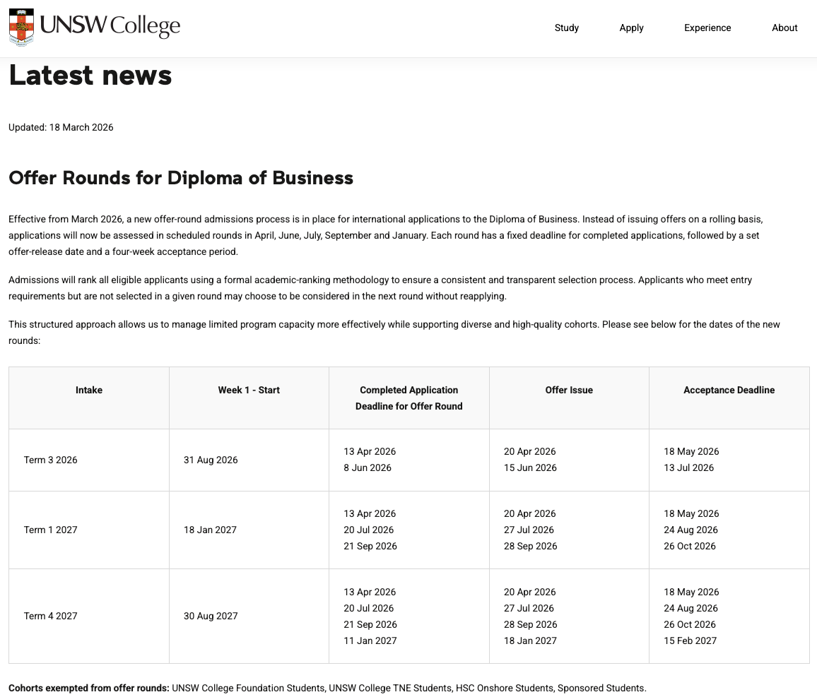
Here's the latest news from UNSW Sydney "AD"p{ margin:10px 0; padding:0; } table{ border-collapse:collapse; } h1,h2,h3,h4,h5,h6{ display:block; margin:0; padding:0; } img,a img{ border:0; height:auto; outline:none; text-decoration:none; } body,#bodyTable,#bodyCell{ height:100%; margin:0; padding:0; width:100%; } .mcnPreviewText{ display:none !important; } #outlook a{ padding:0; } img{ -ms-interpolation-mode:bicubic; } table{ mso-table-lspace:0pt; mso-table-rspace:0pt; } .ReadMsgBody{ width:100%; } .ExternalClass{ width:100%; } p,a,li,td,blockquote{ mso-line-height-rule:exactly; } a[href^=tel],a[href^=sms]{ color:inherit; cursor:default; text-decoration:none; } p,a,li,td,body,table,blockquote{ -ms-text-size-adjust:100%; -webkit-text-size-adjust:100%; } .ExternalClass,.ExternalClass p,.ExternalClass td,.ExternalClass div,.ExternalClass span,.ExternalClass font{ line-height:100%; } a[x-apple-data-detectors]{ color:inherit !important; text-decoration:none !important; font-size:inherit !important; font-family:inherit !important; font-weight:inherit !important; line-height:inherit !important; } table[align=left]{ float:left; } table[align=right]{ float:right; } #bodyCell{ padding:10px; } .templateContainer{ max-width:600px !important; } a.mcnButton{ display:block; } .mcnImage,.mcnRetinaImage{ vertical-align:bottom; } .mcnTextContent{ word-break:break-word; } .mcnTextContent img{ height:auto !important; } .mcnDividerBlock{ table-layout:fixed !important; } body,#bodyTable{ background-color:#FAFAFA; } #bodyCell{ border-top:0; } .templateContainer{ border:0; } h1{ color:#202020; font-family:Helvetica; font-size:26px; font-style:normal; font-weight:bold; line-height:125%; letter-spacing:normal; text-align:left; } h2{ color:#202020; font-family:Helvetica; font-size:22px; font-style:normal; font-weight:bold; line-height:125%; letter-spacing:normal; text-align:left; } h3{ color:#202020; font-family:Helvetica; font-size:20px; font-style:normal; font-weight:bold; line-height:125%; letter-spacing:normal; text-align:left; } h4{ color:#202020; font-family:Helvetica; font-size:18px; font-style:normal; font-weight:bold; line-height:125%; letter-spacing:normal; text-align:left; } #templatePreheader{ background-color:#FAFAFA; background-image:none; background-repeat:no-repeat; background-position:center; background-size:cover; border-top:0; border-bottom:0; padding-top:9px; padding-bottom:9px; } #templatePreheader .mcnTextContent,#templatePreheader .mcnTextContent p{ color:#656565; font-family:Helvetica; font-size:12px; line-height:150%; text-align:left; } #templatePreheader .mcnTextContent a,#templatePreheader .mcnTextContent p a{ color:#656565; font-weight:normal; text-decoration:underline; } #templateHeader{ background-color:#FFFFFF; background-image:none; background-repeat:no-repeat; background-position:center; background-size:cover; border-top:0; border-bottom:0; padding-top:9px; padding-bottom:0; } #templateHeader .mcnTextContent,#templateHeader .mcnTextContent p{ color:#202020; font-family:Helvetica; font-size:16px; line-height:150%; text-align:left; } #templateHeader .mcnTextContent a,#templateHeader .mcnTextContent p a{ color:#007C89; font-weight:normal; text-decoration:underline; } #templateBody{ background-color:#ffffff; background-image:none; background-repeat:no-repeat; background-position:center; background-size:cover; border-top:0; border-bottom:2px solid #EAEAEA; padding-top:0; padding-bottom:9px; } #templateBody .mcnTextContent,#templateBody .mcnTextContent p{ color:#202020; font-family:Helvetica; font-size:16px; line-height:150%; text-align:left; } #templateBody .mcnTextContent a,#templateBody .mcnTextContent p a{ color:#007C89; font-weight:normal; text-decoration:underline; } #templateFooter{ background-color:#221f20; background-image:none; background-repeat:no-repeat; background-position:center; background-size:cover; border-top:0; border-bottom:0; padding-top:9px; padding-bottom:9px; } #templateFooter .mcnTextContent,#templateFooter .mcnTextContent p{ color:#ffffff; font-family:Helvetica; font-size:12px; line-height:150%; text-align:center; } #templateFooter .mcnTextContent a,#templateFooter .mcnTextContent p a{ color:#ffe600; font-weight:normal; text-decoration:underline; } @media only screen and (min-width:768px){ .templateContainer{ width:600px !important; } } @media only screen and (max-width: 480px){ body,table,td,p,a,li,blockquote{ -webkit-text-size-adjust:none !important; } } @media only screen and (max-width: 480px){ body{ width:100% !important; min-width:100% !important; } } @media only screen and (max-width: 480px){ .mcnRetinaImage{ max-width:100% !important; } } @media only screen and (max-width: 480px){ .mcnImage{ width:100% !important; } } @media only screen and (max-width: 480px){ .mcnCartContainer,.mcnCaptionTopContent,.mcnRecContentContainer,.mcnCaptionBottomContent,.mcnTextContentContainer,.mcnBoxedTextContentContainer,.mcnImageGroupContentContainer,.mcnCaptionLeftTextContentContainer,.mcnCaptionRightTextContentContainer,.mcnCaptionLeftImageContentContainer,.mcnCaptionRightImageContentContainer,.mcnImageCardLeftTextContentContainer,.mcnImageCardRightTextContentContainer,.mcnImageCardLeftImageContentContainer,.mcnImageCardRightImageContentContainer{ max-width:100% !important; width:100% !important; } } @media only screen and (max-width: 480px){ .mcnBoxedTextContentContainer{ min-width:100% !important; } } @media only screen and (max-width: 480px){ .mcnImageGroupContent{ padding:9px !important; } } @media only screen and (max-width: 480px){ .mcnCaptionLeftContentOuter .mcnTextContent,.mcnCaptionRightContentOuter .mcnTextContent{ padding-top:9px !important; } } @media only screen and (max-width: 480px){ .mcnImageCardTopImageContent,.mcnCaptionBottomContent:last-child .mcnCaptionBottomImageContent,.mcnCaptionBlockInner .mcnCaptionTopContent:last-child .mcnTextContent{ padding-top:18px !important; } } @media only screen and (max-width: 480px){ .mcnImageCardBottomImageContent{ padding-bottom:9px !important; } } @media only screen and (max-width: 480px){ .mcnImageGroupBlockInner{ padding-top:0 !important; padding-bottom:0 !important; } } @media only screen and (max-width: 480px){ .mcnImageGroupBlockOuter{ padding-top:9px !important; padding-bottom:9px !important; } } @media only screen and (max-width: 480px){ .mcnTextContent,.mcnBoxedTextContentColumn{ padding-right:18px !important; padding-left:18px !important; } } @media only screen and (max-width: 480px){ .mcnImageCardLeftImageContent,.mcnImageCardRightImageContent{ padding-right:18px !important; padding-bottom:0 !important; padding-left:18px !important; } } @media only screen and (max-width: 480px){ .mcpreview-image-uploader{ display:none !important; width:100% !important; } } @media only screen and (max-width: 480px){ h1{ font-size:22px !important; line-height:125% !important; } } @media only screen and (max-width: 480px){ h2{ font-size:20px !important; line-height:125% !important; } } @media only screen and (max-width: 480px){ h3{ font-size:18px !important; line-height:125% !important; } } @media only screen and (max-width: 480px){ h4{ font-size:16px !important; line-height:150% !important; } } @media only screen and (max-width: 480px){ .mcnBoxedTextContentContainer .mcnTextContent,.mcnBoxedTextContentContainer .mcnTextContent p{ font-size:14px !important; line-height:150% !important; } } @media only screen and (max-width: 480px){ #templatePreheader{ display:block !important; } } @media only screen and (max-width: 480px){ #templatePreheader .mcnTextContent,#templatePreheader .mcnTextContent p{ font-size:14px !important; line-height:150% !important; } } @media only screen and (max-width: 480px){ #templateHeader .mcnTextContent,#templateHeader .mcnTextContent p{ font-size:16px !important; line-height:150% !important; } } @media only screen and (max-width: 480px){ #templateBody .mcnTextContent,#templateBody .mcnTextContent p{ font-size:16px !important; line-height:150% !important; } } @media only screen and (max-width: 480px){ #templateFooter .mcnTextContent,#templateFooter .mcnTextContent p{ font-size:14px !important; line-height:150% !important; } }Quarter 1, 2026 Edition — UNSW Sydney Agents Newsletter. 1,申请系统即将在26年6月从Apply Online转换为StudyLink2,2027年申请现已全面开放;2026年T3开学的Master of Information Technology (MIT)和Master of Laws (LLM) 课程仍有余位开放申请中,查看更多3,新的托福考试形式目前正在接受审核,在未接到进一步通知前大学不予认可。与此同时,为确保托福 iBT 考试成绩适用于大学的评估目的,申请者在报名考试时必须选择“Taking TOEFL for Australia” 查看更多4,2026年T3奖学金申请开放时间为4月1日至6月18日,鼓励即将入学的国际学生全面审视现有各项机会,并尽早采取行动,查看更多5,医学健康、工程、商学院、航空学士学科信息更新,查看如下资讯原文6,2027年T1 PhD, Master by Research and Master of Philosophy programs 博士课程申请以及相关奖学金申请开放中,查看更多7,UNSW College 2027年课程申请已开放,查看更多8,针对通过 SAT 考试申请入学的国际学生网页,并提供各类实用信息,包括重要日期、入学要求以及指导建议,以帮助学生迈出迈向大学生涯的下一步。查看更多Welcome to the UNSW quarterly partner update and thank you for your continued support. As we move towards finalising our 2026 admissions cycle following our recent Priority Application Weeks for Term 3, 2026, we will soon communicate full details on our planned transition from Apply Online to StudyLink. This system switch is expected in the middle of June 2026 and a bespoke email will be shared in the coming weeks. In this email, we bring you some operational updates on our admissions and faculties, the latest QS Subject Rankings, as well as upcoming events for your students. Navigate to the highlights of this issue:Admission & scholarshipsFaculty and program updatesEventsInformation for your studentsMeet our peopleAdmission and scholarships2027 applications now openApplications for all 2027 intakes opened on Wednesday, 18 February 2026. Applicants can now submit applications for eligible programs commencing in 2027. Learn moreLLM and MIT remain open for Term 3, 2026The final grouped offer rounds for Term 3, 2026 for Master of Information Technology (MIT) and Master of Laws (LLM) have now passed. Due to additional capacity in these programs UNSW will continue to accept applications, and issue offers for Term 3, 2026 through general offer rounds. Term 3, 2026 applications for these programs remain open, and we encourage you to submit applications for eligible students. Read moreTOEFL iBT UpdateThe new TOEFL format is currently under review and is not accepted by UNSW until further notice. In the meantime, to ensure TOEFL iBT results are valid for UNSW assessment purposes, applicants must select “Taking TOEFL for Australia” when registering for the test.Read moreScholarship applications for Term 3, 2026 are now openScholarship applications for international students are open from Wednesday, 1 April to Thursday, 18 June 2026. We encourage international students commencing in Term 3, 2026 to review the full range of available opportunities and apply early. Read moreFaculty and program updates Medicine and HealthOn-demand: Medicine International Information Session Our recent Medicine International Information Session provided insights into the dynamic blend of hands-on clinical experience and research-focused learning on our medicine programs, as well as detailed information on the admissions process for international students commencing in 2027. Watch recording EngineeringRanked #1 in Australia For the ninth year in a row, the University topped the nation in the broad category Engineering & Technology, with UNSW’s highest-ranking subject, Mineral & Mining Engineering (ranked 3rd globally), in the global top 10 for the tenth year. In total, 39 UNSW subjects placed in the global top 100, with rankings based on academic reputation, employer reputation and research citations. See the lastest 2026 QS World University Rankings by Subject Business SchoolAGSM’s MBA ranked in the global top 50 AGSM’s full-time MBA has achieved a remarkable 19-place jump to 48th in the 2026 Financial Times Global MBA Rankings and is proudly Australia’s only MBA in the top 100. Rising 50 places since 2022, this achievement highlights AGSM’s global excellence. Discover our MBA ScienceBachelor of Aviation (Flying) application changes The interview requirement for entry into the Bachelor of Aviation (Flying) has been replaced with an online aptitude test. The new process requires students to:Submit the Application for Aptitude Admissions Test form Prepare with practice tests Access and complete the test* within two weeks of receiving access Review results Apply via UNSW Apply Online*Please note the test will attract a is non-refundable fee of $A55. Read moreGraduate Research SchoolApply now for 2027 Higher Degree Research programs Applications are open for UNSW PhD, Master by Research and Master of Philosophy programs, as well as scholarships commencing in Term 1, 2027. View HDR application key dates UNSW CollegeUNSW College 2027 intakes are open Applications are now open for 2027 intakes of the UNSW College programs. UNSW College offers a range of pathway programs for students looking to progress to UNSW Sydney, including Diplomas, Academic English, Foundation Studies and Pre-Masters programs. Explore moreBack to highlights Events Upcoming event: Indonesia Open DaysUNSW Sydney is heading to Indonesia! This is the perfect opportunity for your students to explore our world-class programs, learn about student life in Sydney and submit early applications to secure their preferred program for 2027. Medan: Thursday, 30 JulyJakarta: Saturday, 1 AugustSurabaya: Sunday, 2 AugustRegistrations opening soon. Keep an eye on our events page for updates. Explore eventsBack to highlights Information for your students Check out our new dedicated webpage to SAT candidatesWe have launched a webpage dedicated for international students looking at entry via SAT tests. This page is designed to support students as they transition from high school to UNSW Sydney, with useful information including key dates, entry requirements and guidance to support your students as they take their next step towards university. Read moreBack to highlights Meet our peopleAlumni spotlight: Jonas Lim – Bachelor of Design/MediaBuilt on skills he learned from UNSW’s Bachelor of Design/Media, Jonas Lim created ‘Thrive’ – a Figma prototype for a financial mobile app designed to make money management more accessible for young people. Jonas set out to build an all-in-one platform where Gen Z can manage their money, develop healthy habits, and learn about budgeting and investing through a clear, engaging, gamified interface. Discover Thrive
更新时间:26-05-01 来源:OfferEasy官网
 OfferEasy
/ 选学校
/ 澳洲大学
/ 新南威尔士大学
OfferEasy
/ 选学校
/ 澳洲大学
/ 新南威尔士大学


